They say less is more, and this is true in several instances—makeup, clothing (not less clothes, but less unnecessary accessories), and yes, even in website design. While it is important to make everything in your site accessible, be careful not to make it look too cluttered. You don’t need to take a graphic design course to realize that a messy website wards off people and a simple, clean one will make them want more. Building on that assumption, here’s how to achieve that minimalistic UX (user experience) look:
Design with purpose
The first thing you need to do is to clearly define the main elements of your website. It is truly tempting to place all sorts of cool-looking icons and advertisements to spice up your site’s look, but which of these NEED to be in your site? One philosophy that could help: If you don’t think it absolutely HAS to be there, then get rid of it or place it somewhere else. It’s a rephrasing of the famous saying, “When in doubt, don’t.” Only include those elements that will contribute to the overall purpose of your website. Make a rough sketch on paper first if you have to.
Stick to one or two color schemes
It is very tempting to make a website as colorful as possible, but too many colors can also be distracting, unless you’re making a children’s website. Use up to two colors (and varying shades) that complement each other, and perhaps a third one for links. Check out these photos for some examples:
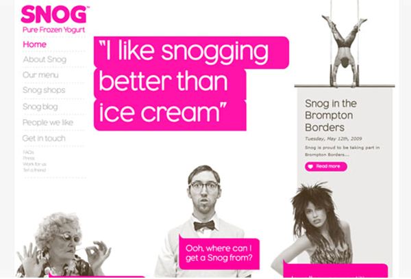
This frozen yogurt website (http://www.ifancyasnog.com) uses gray scale perfectly balanced with hot pink.
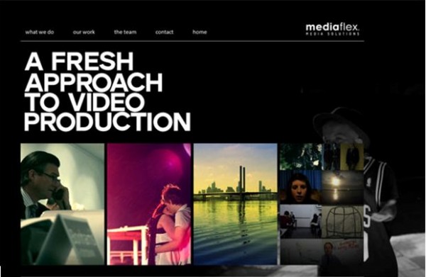
This production website (http://www.mediaflex.com.au) capitalizes on black, and lets its contents add color variations to the overall look.
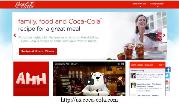
Another piece of advice, if you are making a website for your company or product or service and you already have a logo, it would be wise to build your website colors on said logo. For example, the Coca Cola website:
Don’t use too much fonts
Like colors, too much font styles can be confusing, especially if they’re just there for the sake of being there. Use different font families and sizes to classify and organize your web content, not just because they look cool. It goes back to the first point: design with purpose. Below are some examples for your reference:
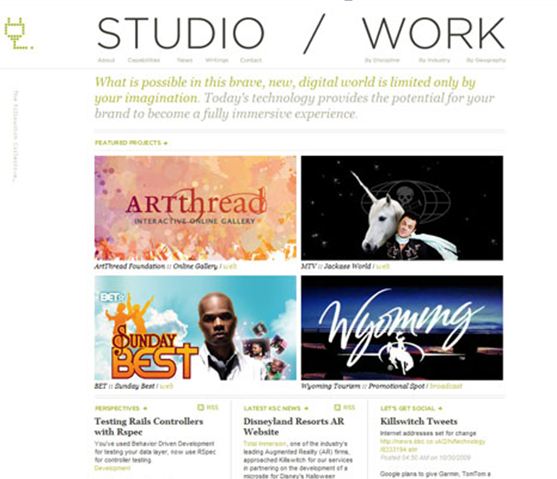
http://killswitchcollective.com
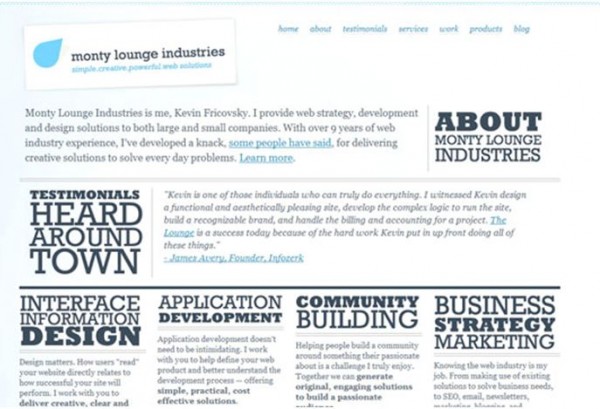
http://www.montylounge.com
Here are some recommended fonts for web designing.
Spell it all out for the user
What do I mean by this? Your target audience was not there with you when you created the website, so don’t expect them to be able to notice every nook and cranny (read: every little link) you place in your site. Chances are they don’t have much time to search for the things they need from your site, so not being able to find them in an instant will send them to another website that provides the same things you do, only better. Keep your customers tied to your website by making everything crystal clear. An example of a badly organized website is seen below:
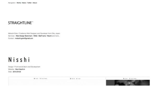
http://straightline.jp
A better example would be this website:
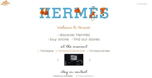
http://www.hermes.com/index_us.html
Make navigation a breeze
Basically, if your website were a hotel, you’d want to give the user your best suite and the best room service. If you plan to add animations and other effects to your website, make sure they reinforce your content. Don’t capitalize on these effects to make your website look “better,” because chances are, it won’t look better. Again, put a purpose to these navigation effects. Simplify, as much as possible.
Leave lots of space
Leave room for your user’s eyes to breathe and take things in one at a time. Take this website as something to learn from:

http://uglytub.com
At first glance, the user should be able to capture the whole of your website’s content. Don’t put too much material in one page. Your customer will leave or get bored if he/she doesn’t get your point within the first five to ten seconds of being in your website. Like this one:
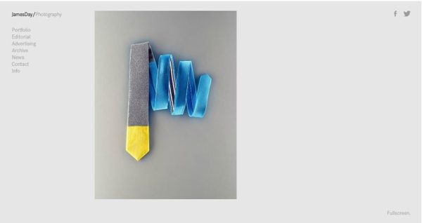
http://www.jamesdayphoto.com
Balance your content
Or don’t. Either way, you have to make it consistent. Even if your content is simplified and you have a lot of space, if the content is all over the place, then your site would still look bad. Perhaps these principles would help you design your website and balance your content:
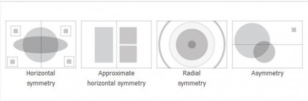
These are merely rough guides to help you out. Of course, you don’t have to be limited to these to make your website look appealing. Here are some examples of websites that use the different kinds of symmetry:
a. Horizontal symmetry
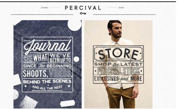
http://www.percivalclo.com
b. Approximate horizontal symmetry
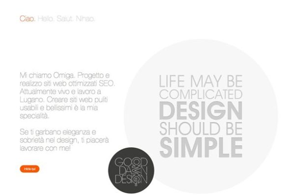
http://www.omigapun.com
c. Radial symmetry
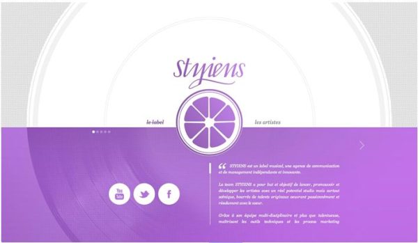
http://www.styiens.com
d. Asymmetry
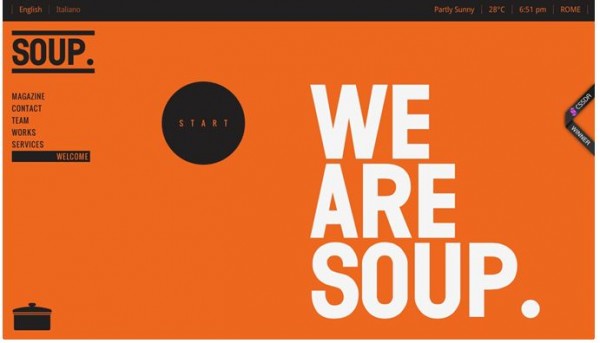
http://www.soupagency.it/#soup
I really hope you were able to find some inspirations for designing your own website. Just remember to keep it simple and let go of any unnecessary elements, and you should be on your way to attract more audiences and users!
+Celina Conner is a Yoga Instructor, a holder of a Marketing Diploma and a mother of a beautiful daughter, Krizia. She has a passion in cooking and formulating vegan recipes.