Blogging is a fantastic thing; it allows us to express ourselves, advertise our business or skills or even just keep our friends and family up to date with what we’re doing. There are no shortage of blogs on the web today and an increasing number of these are now aiming to provide excellent advice and information to readers. However, you might not be reaching as many readers as you could be, for one very simple reason; you aren’t optimized for mobile.
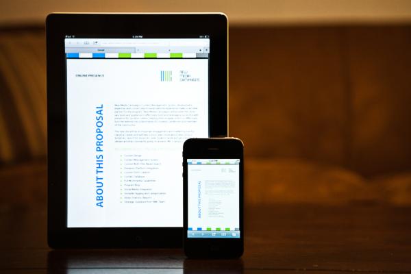
91% of the world’s population now own a mobile phone, 56% of these are smartphones. Of those with mobile phones 50% use their phone as a primary source of internet access. From this we can assume that roughly one third of those accessing your blog are doing so on a mobile device, though of course this will vary depending on the market you appeal to. Have you ever looked at your blog from a mobile device? Is it still as attractive as you thought?
There are three things you should consider about a mobile website; appearance, loading time and content. This doesn’t just apply to a commercial website but blogs too and even if you aren’t a web designer or developer with knowledge of how to create a mobile version of your website there are certain things that you can do to aid the optimisation process and help your blog get better results for your mobile using audience.
Appearance
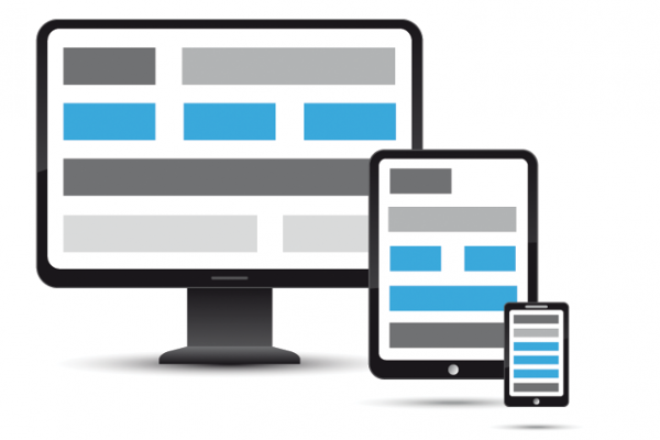
While the obvious thing would be to create a mobile version of your blog it is also true that those capable of doing so probably already have, so the best you can do if you are unable to accomplish this is to either pay someone to do it for you or simplify your website so that it appears nicely on both desktop and mobile devices. If you’re using a blog service like the Google hosted option Blogger then you already have a mobile version; it is automatically built in and you don’t have to do anything to accomplish the fantastic results, however if you host yourself or aren’t using a specific blogging service you may need to take some time to try out new things that will make it a little better in terms of mobile access.
Start by grabbing your phone and opening your blog. How does it look? How easy is it to read? How easy is it to navigate? These are the sorts of questions you should be asking yourself. You may find you need to adopt a slightly different layout, make your navigation options bigger or make your images a little smaller. Make things as good as you can get them and stick to it.
Loading Time

If you’re using the Wi-Fi to view your website turn it off and use your 3G. A lot of your viewers might be trying to view your blog on the move and will probably be using the internet provided by their network. Try viewing it again. Did everything load as quickly? Did the quality of the images drop? Phone don’t generally use as high internet speeds and limit sizes of images and such so as to reduce the cost of the data used, you can help your viewers by using small size images and dropping image quality in areas. Obviously you want high quality, detailed images in galleries and such where the quality of an image is important, but images that accompany your articles, profile images on your about page and banner images around your website can probably stand to be dropped in quality slightly to help out some of your mobile using readers.
Content

A big blog of text on your computer screen is a bigger block of text on your phone. Lay out your articles and content in a way that is easy to browse, this makes it easier for those using a smaller screen to see everything and find the information they want, it is also very easy for you to implement. Using subheadings and headings around your website religiously; the more they’re there the easier everything is to find. You can use bold and colour in the place of sub-headings to draw attention to particular information within an existing subheading, such as the topic line of an important sentence within a paragraph. Use bullet points, short sentences and don’t over-use images with articles. The easier the information is to digest the better.
Author Bio
Kate Critchlow is a freelance writer with a passion for technology, marketing online and blogging in particular and currently works for Dimasoft, a company providing a range of internet and software services.


It is really great idea to optimize your blog for mobile user because there are more than 80% people using mobile phone or smartphones. thanks keep do post like this.